I was checking my recent comments RSS feed today and noticed two new comments, which is how I am able to so quickly respond to people on my website when they post something. What set these comments apart from others is they were very considerate ones compared to most. I figured I'd post them in my blog as a form of thanking the commenter's for giving me a self esteem boost and a good laugh. I also need an example of "quotations" in my blog/article posts because I felt like styling those with my fancy dancy blockquote styling technique.
The first comment comes from Pierre Loubert. (Oh I also forgot this also gives me the chance to show off my new comment styling as well as the ability to link directly to a specific comment).
OK, this has nothing to do with what I am looking for, but I thought I'd tell you how amazing your site design is! Wow, incredible, beautiful and it works in Google Chrome! I like the colors and the transparent "fx"s. Bravo!
I then got a second comment on my "Someone Ripped off My Website's Design! Now What?" article from "Scorned Designer" which if you follow the link he provided, is a pretty comical letter to a competitor that stole their web design.
Neal, You've already handled it pretty professionally, with a much cooler head than most people would probably approach this situation with. I've only seen one more unique way to handle the same situation, when BustedTees, put up a dedication to nerdy shirts, when they borrowed their design.
In website news you may notice, when you hover over this post (on my home page) you will see a "read more" box pop up at the bottom of the post. I added this in with a little JQuery juice. One complaint I've had about my past three renditions of nealgrosskopf.com was that my home page required a lot of vertical scrolling. I tried to fix this with my latest design by doing a two column layout for the home page. I checked my version 2 nealgrosskopf.com design and discovered that it's home page actually required less scrolling than my current one. This angered me as I thought the design would have fixed the problem (which is may, my current content may have just been longer). Anyway, to fix this shortcoming I added a "read more" box to the bottom of my blog posts and reviews, since those are usually my longest blocks of text. If you click on them it should slide down and show the rest of the post. Pretty neat, eh?
Website Launches
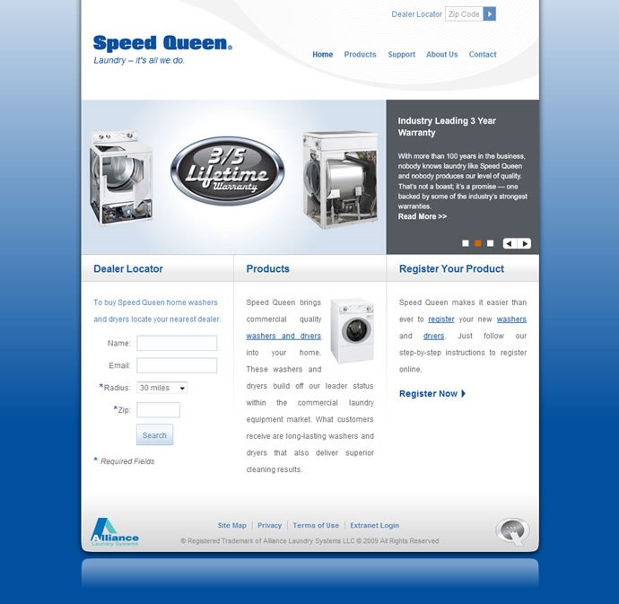
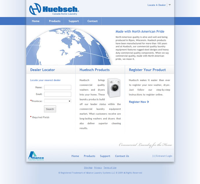
Finally, I launched two new websites at work last Friday which I am very excited about. They were both for our consumer line of product, whereas we are primarily a commercial washer & dryer company.
The first website is our Speed Queen Home Laundry website:
The second website is our Huebsch Home Laundry website:
I've been working on both these websites with my co-worker Brian, for several months now, and it feels great to finally get them up there. When we launched both sites last Friday, it was very stressful and things didn't go like we planned. It also seemed like people were more interested in telling me what was wrong with the site rather than what they liked about them, but I've gotten past that and am now proud of them once again.
I should point out that both sites should have the same or simliar content between them simply because one site is marketed towards Canada while the other is for the U.S. Both of these sites were also where I first learned JQuery so I'll always have a few memories with them regarding that.
Check them out and let me know if you like them.

