Musical Renaissance
Dec 07
| Year | # of CDs bought |
|---|---|
| 2008 | 6 |
| 2009 | 0 |
| 2010 | 13 |
| 2011 | 28 |
| 2012 | 86 |
| 2013 | 59 |
I've been buying a lot of CDs lately. Well that's an understatement I think -
I considered myself to be in what I call a 'Musical Renaissance'. Sort of a great awakening of discovering new music. I've had two other of these events occur in my lifetime. One was in 7th grade when I discovered East-Coast rap like Puff Daddy, Mase and Notorious B.I.G. The second event occurred in the beginning of 9th grade when I discovered Punk & Ska.
This latest wave is similar to the last two in that it included new genres I've discovered.
Dark Ages
I consider the years I was in a relationship/married to be sort of 'dark ages' for me when it comes to music. I bought very little and made little effort to find new stuff during this time. This would be during the years of 2004 to 2010. During this time, I mostly listened the large catalog of music I already owned.
Something else occurred during this time as well that pushed me away. The 'scene' changed. The late 90s & early 2000s were my heyday for genres that I liked. Pop-Punk was on top with bands like Blink 182 making it big. Ska was still big during the late 90s as was Skate-Punk.
By 2004 though, most of those genres had run their course. It's easy to see just by looking at the Warped Tour lineup during 2005. It was all angry music such as Screamo or Metalcore.
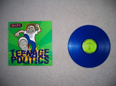
2005 Screamo/Metalcore Warped Tour Examples
90's Emo
Thursday - Understanding in a Car Crash
I was a big Thursday fan in high school. Now I was looking to discover who came before them.
In the fall of 2011, some big changes occurred for me that pushed me back towards music. The biggest was: I started dating again, which I hadn't done in 3 years. Because of this I started feeling all of that pain that comes from dating all over again. Like other times in life when I had trouble, I turned to once more.
This time around, I was interested in learning more about the inspiration for a lot of the early 2000s Emo bands that I liked in high school such as Thursday, Taking Back Sunday and Senses Fail.
What I ended up doing was reading the Wikipedia article and using it as a guideline of what bands to listen to. After reading up on that, I ended up buying several CDs all at the same time. This would prove to be an important point in my Musical Renaissance.
Below are the first 5 CDs I bought in this genre. Two years later, these are all ranked very high in my collection.
- At the Drive-In - In/Casino/Out (1998)

- Sunny Day Real Estate - Diary (1994)

- The Get Up Kids - Four Minute Mile (1997)

- The Promise Ring - 30° Everywhere (1996)

- The Promise Ring - Nothing Feels Good (1997)

90's Emo Examples
Here's some of my favorite songs from the genre. Most of the songs are slower, use chiming/non-distorted guitars and can go from quiet to loud as the song progresses.
Easycore
The Wonder Years - Hostels & Brothels
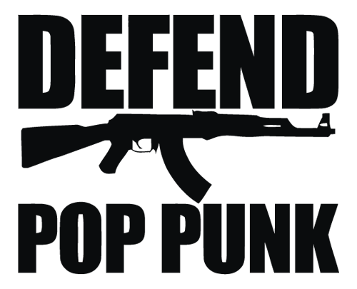
The Wonder Years made me realize there was a thriving Pop-Punk scene going on while I was on musical hiatus.
The next big Musical Renaissance for me would come the next spring in 2012. At this point, I had written off the genre of Pop-Punk as being dead and I hadn't followed it in many years. Little did I know, it made a comeback while I was gone. Starting in 2007, many new bands started releasing music which would later be called Easycore. Easycore is called such as it blends Hardcore-Punk music with Pop-Punk thus instead of being Hard, it's Easy or softer sounding.
While no longer an Easycore band The Wonder Years were first band to make me realize that Pop-Punk wasn't dead and that there was an active community 'defending' it still.
The important CD during this period was The Wonder Years' CD The Upsides, which you may recall, I reviewed a while back on my site. I was fortunate enough to see them live in 2013 down in Milwaukee.
Easycore Examples
Here's some of my favorite songs from that genre. The first song listed below was probably the first Easycore song to appear which was around 2006. Later it blended more elements of Hardcore Punk.
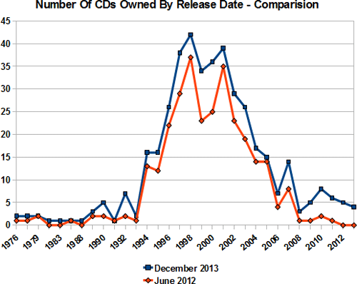
Effect Of The Musical Renaissance
Here's a chart showing CDs I owned - comparing Summer of 2012 vs Winter of 2013. I could probably pull older data but I already had this charted out a while back so it was easier to do. As you can see there's a lot more CDs in the late 2000s which is due to my interest in Easycore.